For this week’s blog post, my policy director, Conor Ryan, asked me to find and analyze a few charts from an Internet source. He also requested that I write up a short summary and analysis for each of these charts. I chose four charts from the article “Immigration Is Changing Much More Than the Immigration Debate,” an article from the Political Blog FiveThirtyEight, which focuses on both election predictions and policy analysis.
The first chart looks at the number of U.S. residents that are foreign-born.

This chart shows the population of the U.S. population that is foreign-born as a percentage of the total population. The percent of foreign-born residents was quite high in the early 1900’s, almost reaching 15% in 1910. However, over time the percentage fell fairly steadily, hitting a low of 5% in 1970. Since 1970, the percent of foreign-born residents has increased quite quickly to about 13% in 2010. However, it does seem to be leveling off somewhat near 2010. Another fact to consider would be the makeup of the foreign-born residents. According to the Wikipedia entry regarding the U.S. Immigration Statistics, most immigrants in the early 1900s were from Europe, while most immigrants in the 2000s are from Latin, Central, and South America.
The second chart focuses on foreign-born residents from Mexico.

This next chart serves to illustrate what I already suspected. The number of U.S. residents born in Mexico has risen quite quickly since 2000, but has leveled off near 2010. This chart also shows that the number of U.S. residents born in Mexico was nowhere near as high in 1980 and 1990. In fact, the number of U.S. residents born in Mexico doubled from 1990 to 2000. A chart that would complement this one would be the number of U.S. residents born in Central America, since in recent years there has been a large influx of immigrants from Central America seeking asylum from violence.
The third chart looks at the makeup of new immigrants by region.

This chart illustrates the amount of U.S. immigrants from Latin American and Asia who stay in the U.S. for less than one year. The chart shows that since 2005 the number of immigrants from Latin American for less than one year has fallen steadily from 400,000 to 210,000 in 2009 and since then has leveled off. However, the number of immigrants from Asia for less than one year has risen from 105,000 in 2000 to 300,000 in 2012, surpassing the amount of Latin American immigrants in 2008. This shows how the makeup of short-term residents is changing rapidly in recent years. One theory points to the lack of short-term work opportunities for Latin American residents, whereas those for Asians are on the rise.
The fourth and final chart looks at an estimate for illegal immigrants by region.
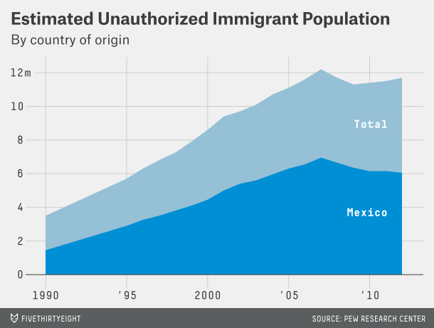
This chart shows an estimate of illegal immigrants in the U.S. by their country of origin. Pew Research made these estimates by simply subtracting the estimated number of legal immigrants from the total number of immigrants reported by the government. It shows that from 1990 until 2007, the number of total illegal immigrants rose from 3.7 million to 12 million, and the number of Mexican illegal immigrants rose from 1.5 million to 6 million. However, since 2007, the number of total illegal immigrants dropped until 2009, and then rose again until reaching about 11.9 million in 2012. Also, since 2007, the number of illegal immigrants from Mexico has fallen similar to the trend in total illegal immigrants, but demonstrated a continued decrease, rather than increase. This could be because since the Financial Crisis the housing market has taken a large hit, and construction jobs, which are popular with illegal Mexican immigrants, have not been as plentiful as before the Financial Crisis.

You must be logged in to post a comment.