Summary
- Data visualization field has gained immense importance in health care industry over the past few years. Every data in health care is represented in a visual format for better understanding.
- Software developers should prioritize self-explanatory feature for health care researchers, not requiring them to have background knowledge in visualization techniques and its utilization.
- While visualizing in health care is helping us to predict a good future for better outcomes, there are some data privacy and security issues that require attention.
Introduction
Data Visualization is defined as a pictorial representation of data that helps identify, analyze, and understand the trends in health care sector. It combines the three main disciplines: scientific visualization, information visualization and visual analytics to encompass designing and analysis of data in health care. At the pinnacle of technical achievement, decision makers find it tough to make decisions based on the complexity of numerical and textual data. Data visualization is a concept that presents these complexities in a simplified visual setting either in a graph or a map.
Background
The demand for accurate mapping and physical measurement has been ever since the 17th century, and data visualization existed particularly in the geographical maps. It was in the 18th century when attempts were made at thematic concept and thematic mapping of geological, economic and health data. Michael Florent Van Langren and William Playfair are known to be inventors of the most popular visual representation of statistical data and graphs we use today.

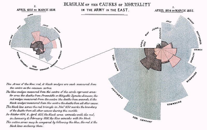
data visualization in the latter half of the 19th century.
This was considered a Golden Age for the initial years of visualizing information.
In the early 20th century, researchers developed the accuracy procedure for a while, the period formally known as the modern dark ages for data visualization. People thought the data was not accurate, found some errors, worked on it, and developed ways to prevent errors and invented strategies to make perfect charts and graphs.
The rebirth of these visualizations was not until researchers studied the importance of visuals with human brain. 90% of the information transmitted to the brain is visual, humans process images 60,000 times faster than text. 70% of our sensory receptors are in our eyes and 65% of people are visual learner’s. Studies have also shown that while only 10 to 20% of written or spoken data is remembered, 65% of information is remembered when it’s presented visually in short what this means is visual data is easier to remember than words.
It is important to note the Godfather of data visualization – Edward Tufte, who did infographics before anyone and believed in “visualizing the visualizer”.
Uses
Past three to four decades have seen tremendous use of data and its visualization tools in hundreds and thousands of focus areas. However, this post limits to its use in healthcare. Given that, and with the increasing number of various diseases and infections, incidence, prevalence, mortality rates, and data related to all the above and much more infact, it is challenging to digest all of it at once.
Data visualization tools and its application in the healthcare sector helps the intended audience in understanding health care better, improves communication and supports change as it comes in huge numbers. Exploring data to know the trends in a particular disease or health outcome, creating dashboards, compiling an annual report for mortality rates among a particular population are some well known uses.
The pandemic changed a lot in our lives, especially turned us into accessing each and every information just at one click. During this time, the public health system across U.S. including local, state, and federal level professionals turned into using the maximum data visualization tools for delivering health information. The use varied from delivering the numbers of COVID-19 infections, prevention strategies to vaccine information called as “infographics”.
Visualization focuses on helping medical staff identify and react faster to threats in health care. By visualizing real-time data on patient health status, health professionals can define and group patients according to the treatment and attention they need. Below is an example:
Visualization Tools
As people have been visualizing data for a long time, but their ability to use large complex data into ease and fast pace is a relatively new concept. With the development of new tools every decade, it is important for the health professionals to know the most game changing tools for data visualization.
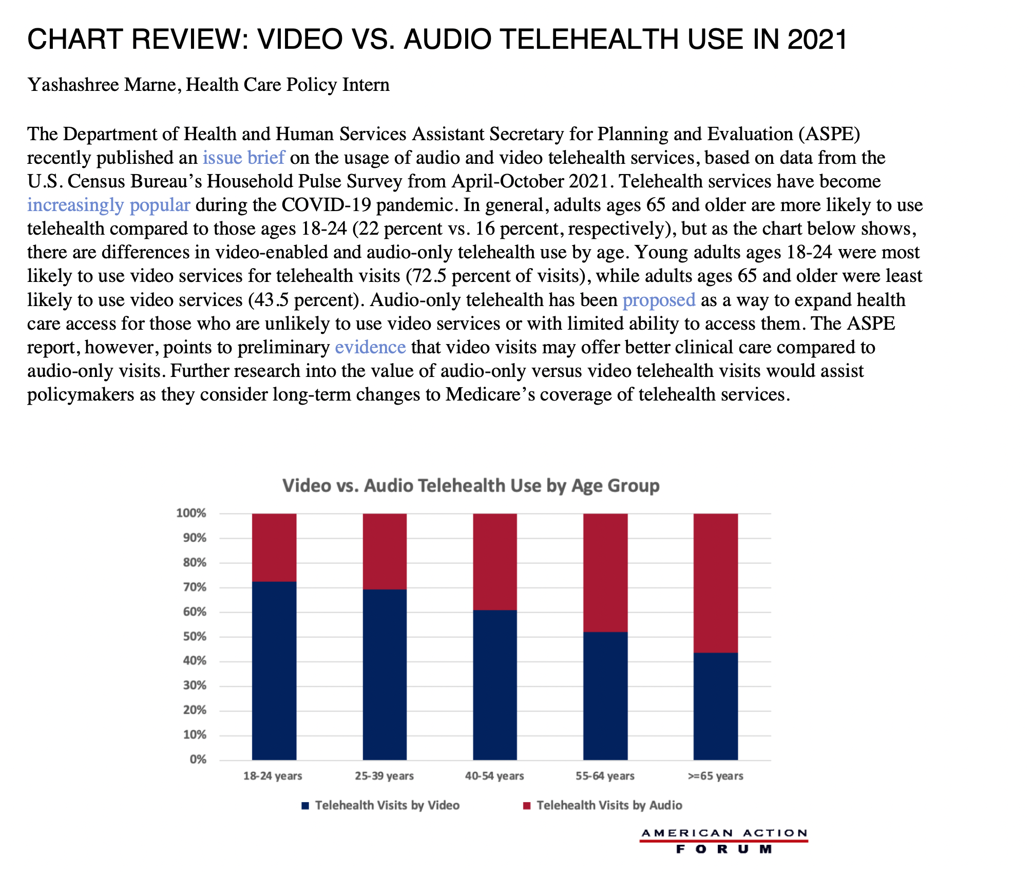
- Microsoft Excel
This tool was introduced 40 years ago, and it empowers people to work with health care data with excel sheets in a click away to form charts. It can be extensively used to show trends of health care spending, telehealth usage, healthcare disparities and suicidal rates in the U.S. Below is an example of presenting data using MS Excel.
This tool is readily available and easy to use. It can also be used to keep track of medications, prescriptions, providing patients with a spreadsheet to keep track of their health records. It’s mostly used by health care administrators in predicting future costs, considering healthcare-specific factors such as the impacts of the seasons and the seasonal illnesses that come.
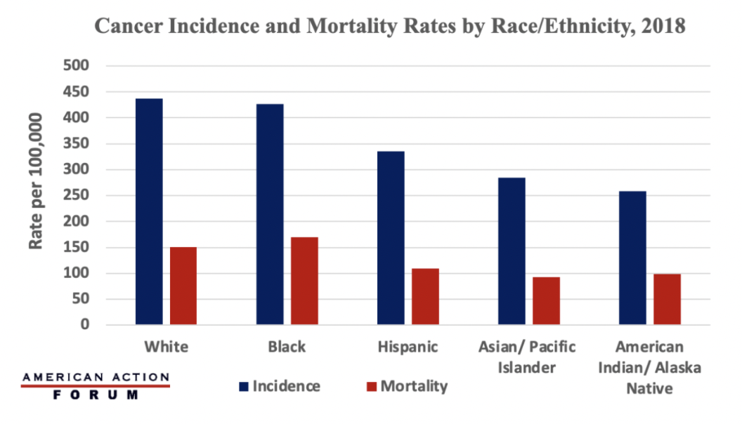
- Tableau
Tableau platform is a very widely used service in the field of business intelligence and health care analytics which allows you to design interactive reports, dashboards, and worksheets. Tableau is known to be the healthcare analytics platform of choice to improve patient experience and care outcomes.
It has outstanding visualization capabilities and has a great performance despite the size of data set, it is easy to use and comes with a healthy community and forum and offers great connectivity to multiple data sources. Physicians, researchers, medical professionals, pharma companies, and all other healthcare stakeholders use tableau. Below is an example of a tableau visualization.
It offers one-year free student membership and comes at a price of $70 per user per month billed annually. Additionally, it comes in a public version which is an open-source version – free and has almost all the features of the paid version and the license version also has a free trial available for two weeks.
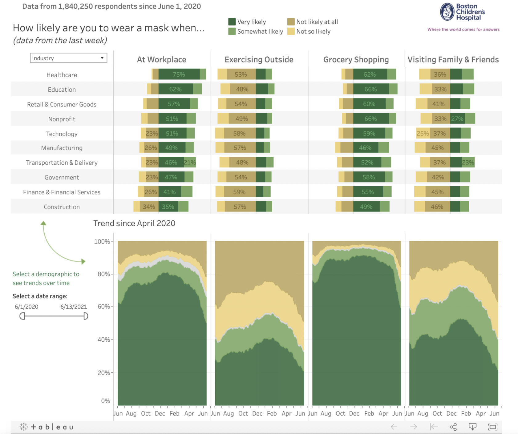
- Microsoft Power BI
Power BI empowers health care workers to analyze patient data and share insights and reports with others in emergency situations to get a comprehensive knowledge and provide critical care promptly. BI provides a foundation for evidence-based clinical decision making and improve patient outcomes by forecasting patient diagnosis. Below is an example of how visualization in Power BI looks like.
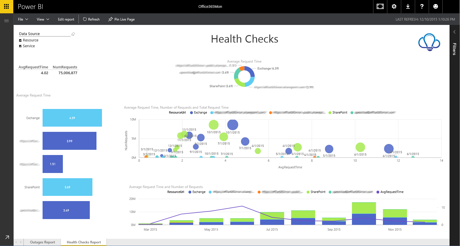
This tool offers a broad variety of data sources, designs customized dashboards and detailed reports, and supports both mobile and web-based analytics. It is available in both free and pro versions and has two enterprise pricing plans the first one is totally free with 1GB data storage limit and the second plan which is the pro plan costs less than $10 per user per month.
Gaps
- Often, the data that is stored or available is not accurate resulting in fragmented patient care. A multidisciplinary approach is a must to enhance data quality, to separate the shackles debilitating the healthcare services, processes, and clinicians and to avoid health related miscommunications.
- Though HIPAA indicates 18 components of protected health information to be ensured while communicating health information, data privacy and security issues continue build the gaps in visualization.
- The ability of a person to read, understand, create, and communicate data as information is a concept called “data literacy”. And with the transformation of health data visualization comes its usage, where most of the challenges come.
- It is vital to educate the health (clinical and medical) professionals with novel visualization techniques.
- With the increasing number of diseases and their data, health professionals are required to have adequate knowledge about data visualization tools. These complex tools are sometimes difficult to understand especially for a person coming from a medical background. Software developers should prioritize self-explanatory feature for health care researchers, not requiring them to have background knowledge in visualization techniques.
- Additionally, having an open-source policy helps increase the usage of the software thereby adding value to healthcare delivery and access to vulnerable populations.
Conclusion
Data visualization field is full of vitality and opportunities to get the robust outcomes in health care industry. Given that, refining the technology, and facing important societal challenges regarding the violation of privacy and the potential misuse of data – (both intentional and unintentional) remain inevitable.
References
https://analystanswers.com/pros-cons-of-data-visualization-the-good-bad-ugly/
https://www.geeksforgeeks.org/advantages-and-disadvantages-of-data-visualization/

You must be logged in to post a comment.